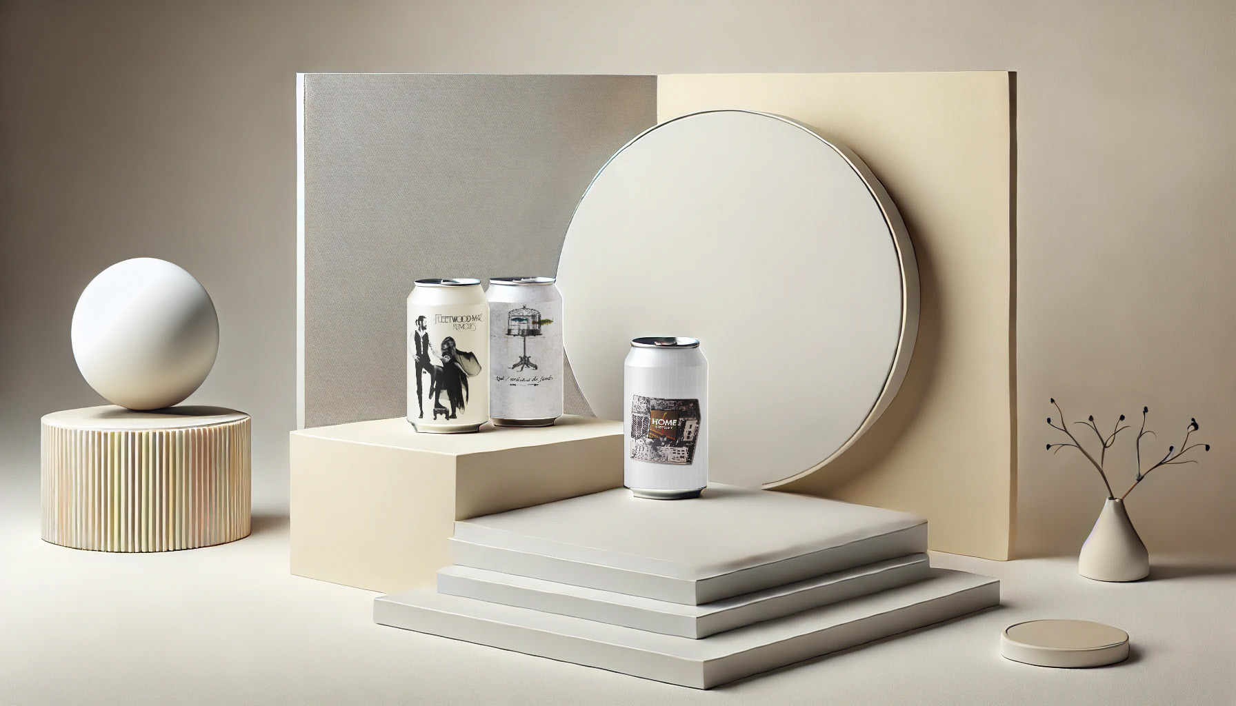
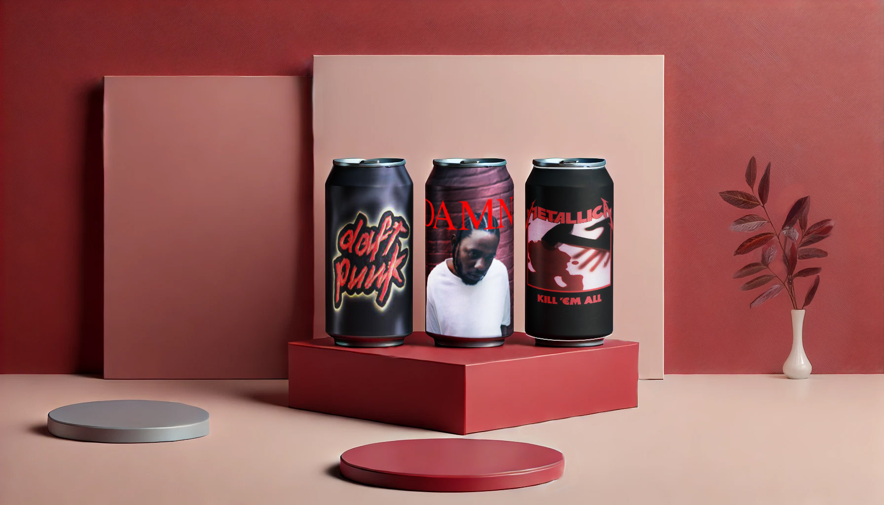
Music as Drinks
This campaign is the only one in the portfolio with a purely creative objective; the intention was to blend art and culture with digestible products, which is how the idea of making them into beverages came to my mind. It was organized and planned by color to develop a consistent identity and color balance in each piece. Which of the following drinks would you like to get?
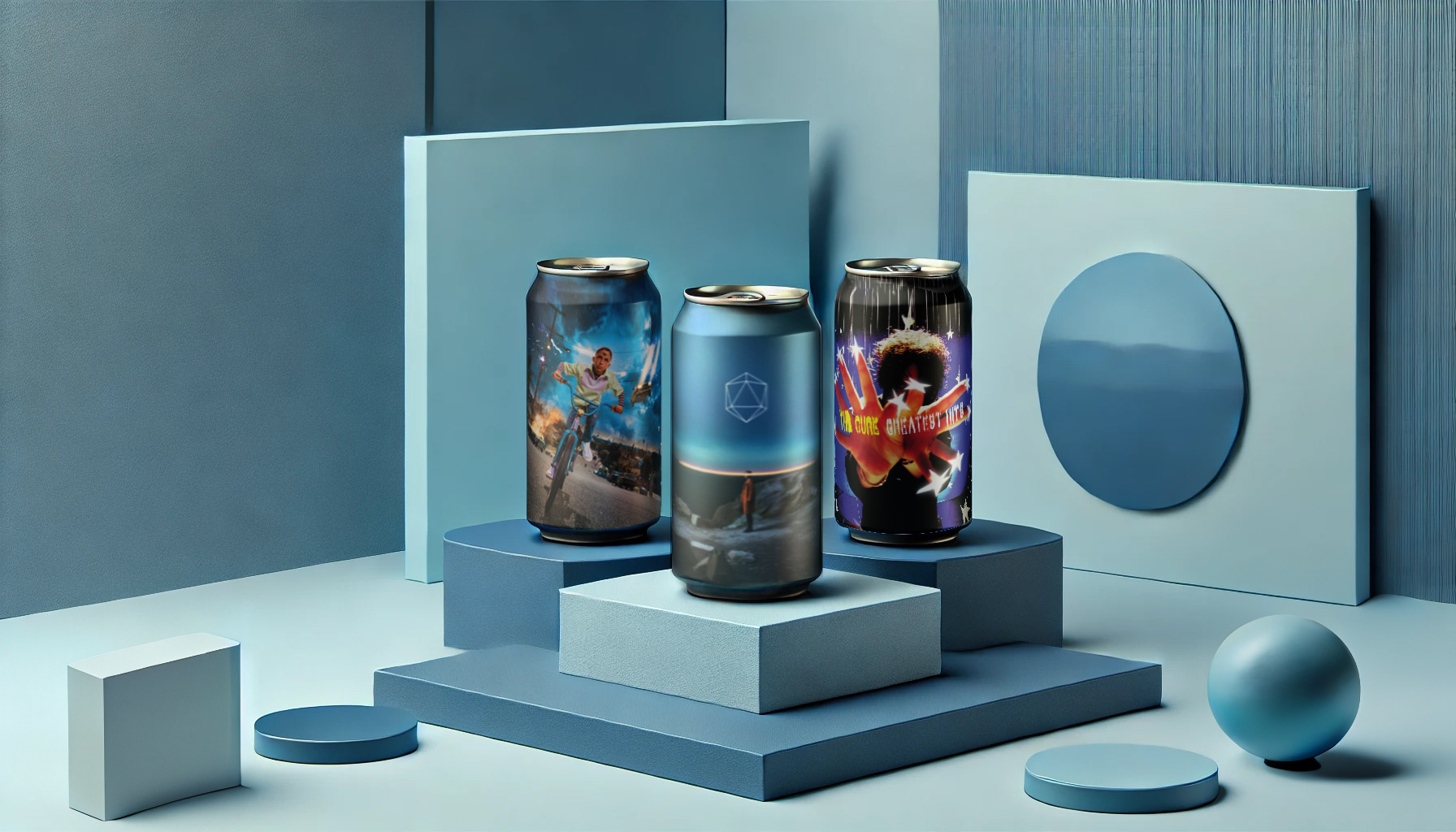
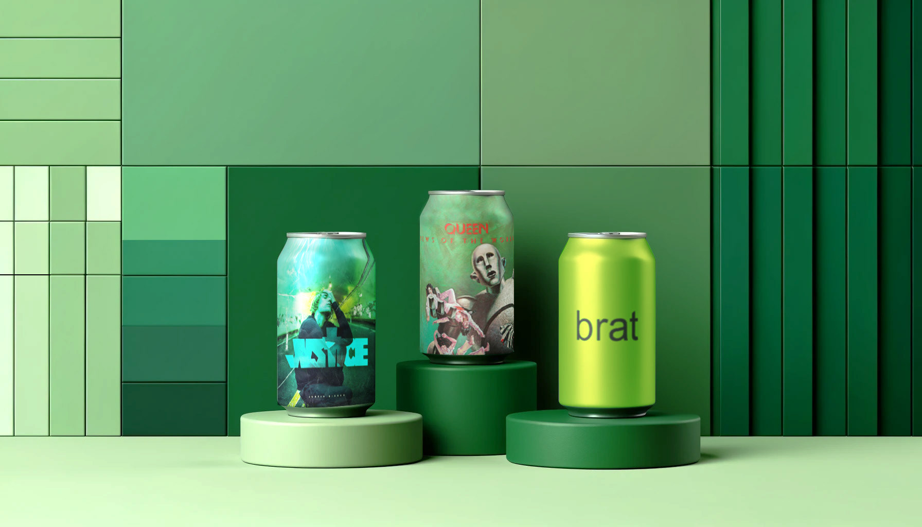
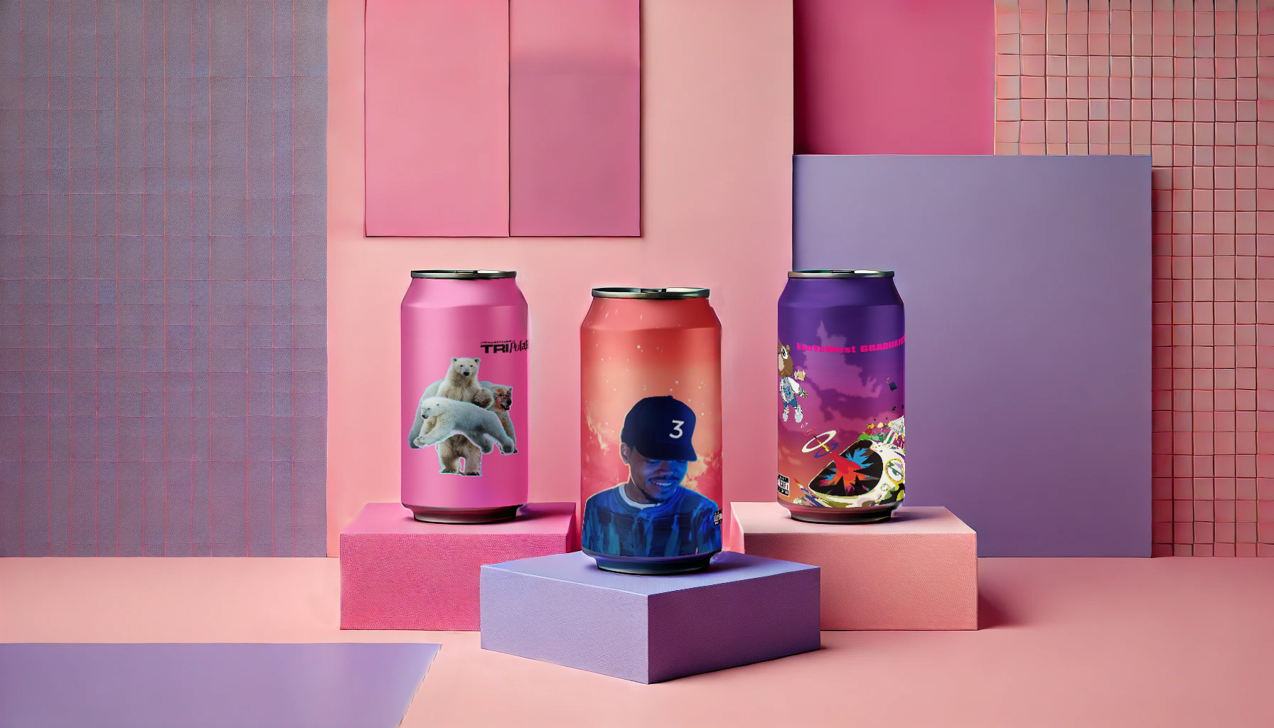
Complementary to this visual campaign, the idea was to integrate AI as a tool that aligns with the creative direction and design skills I have.
Creating scenarios and elements to build a space and add depth to all the arts. On the design, we can feel a strong sense of palette color that gives the image a whole identity and visual world. Hopefully you will find a drink that you enjoy while you listen to it too.
Creating scenarios and elements to build a space and add depth to all the arts. On the design, we can feel a strong sense of palette color that gives the image a whole identity and visual world. Hopefully you will find a drink that you enjoy while you listen to it too.
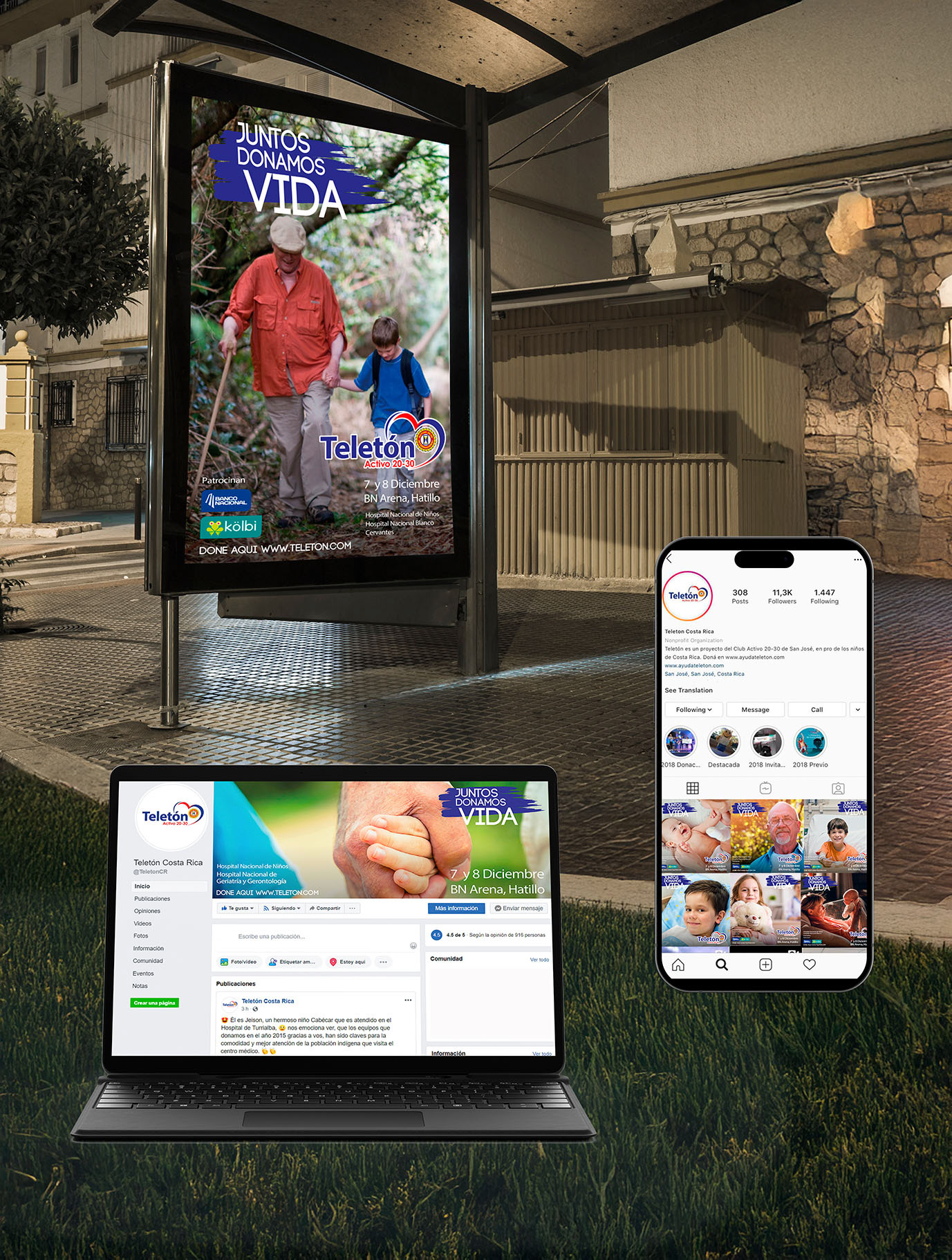
Teleton Costa Rica Juntos Donamos Vida
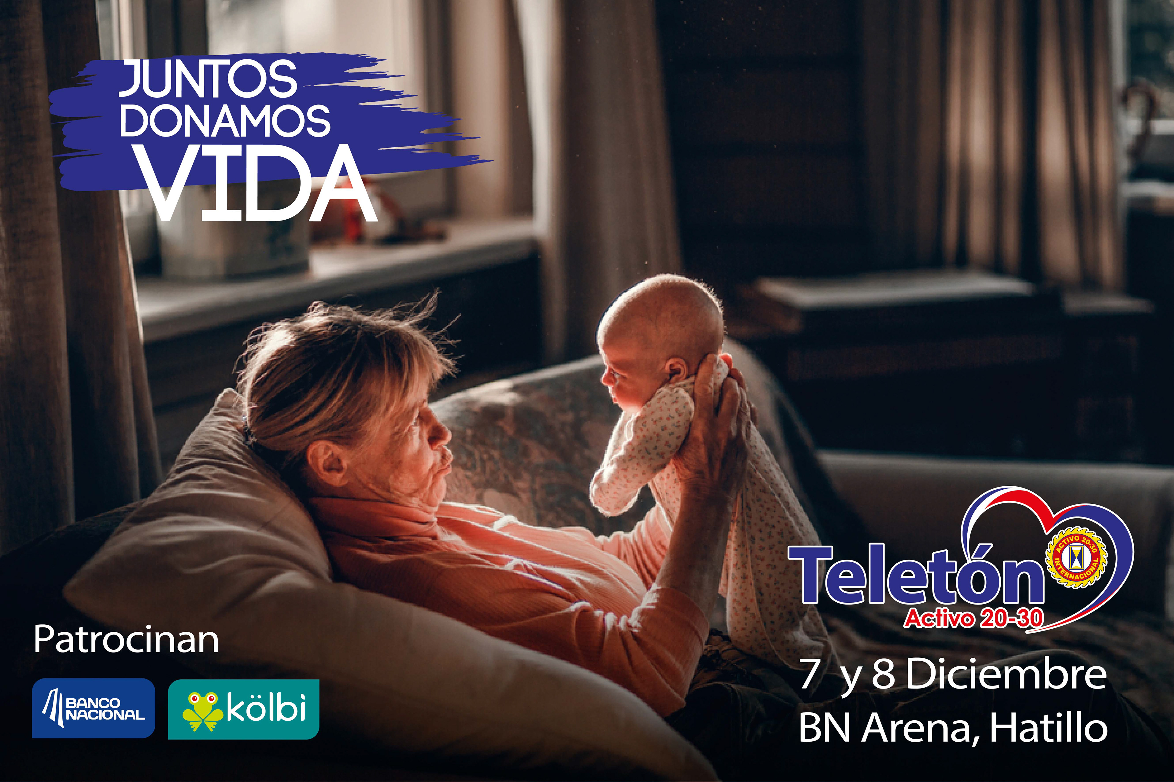
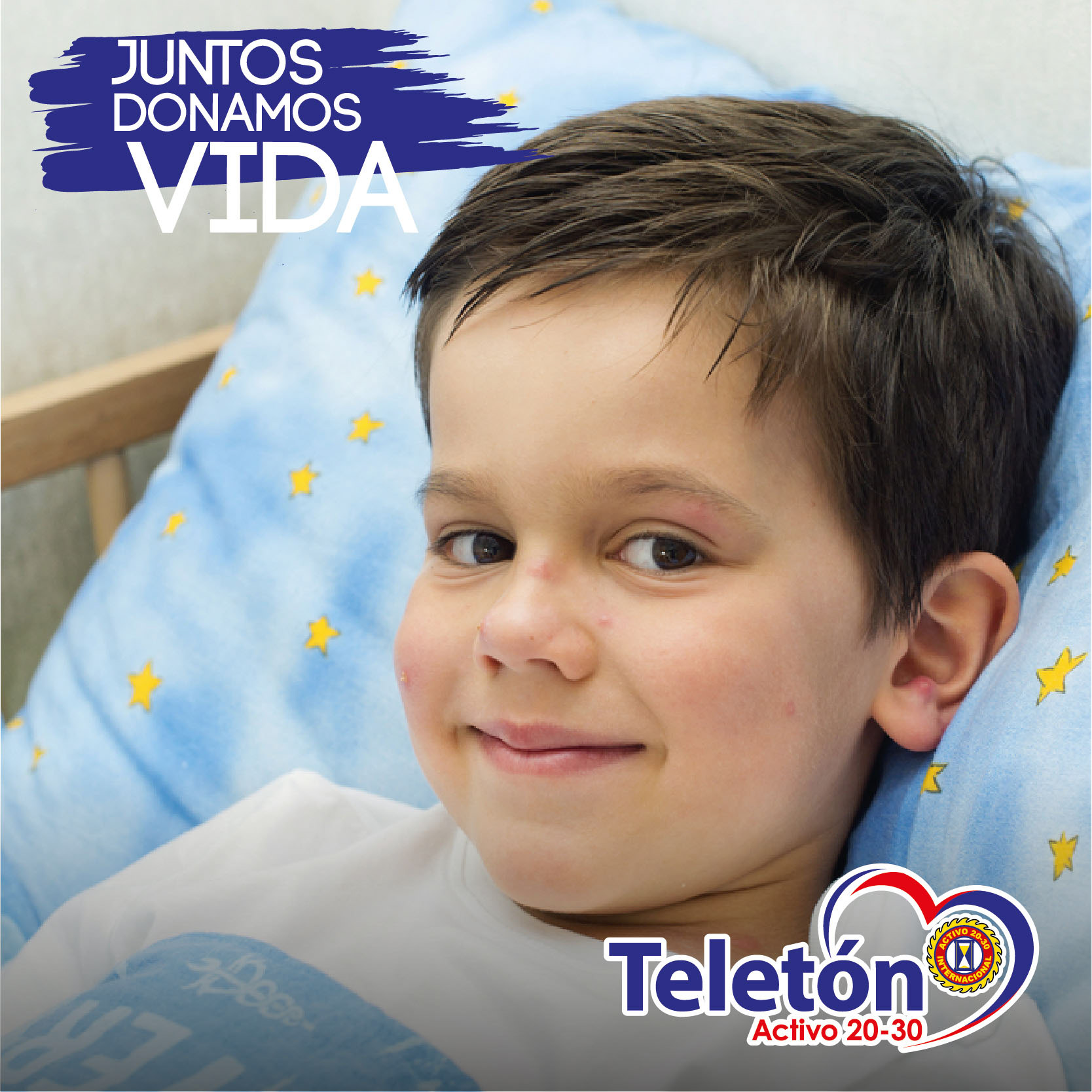
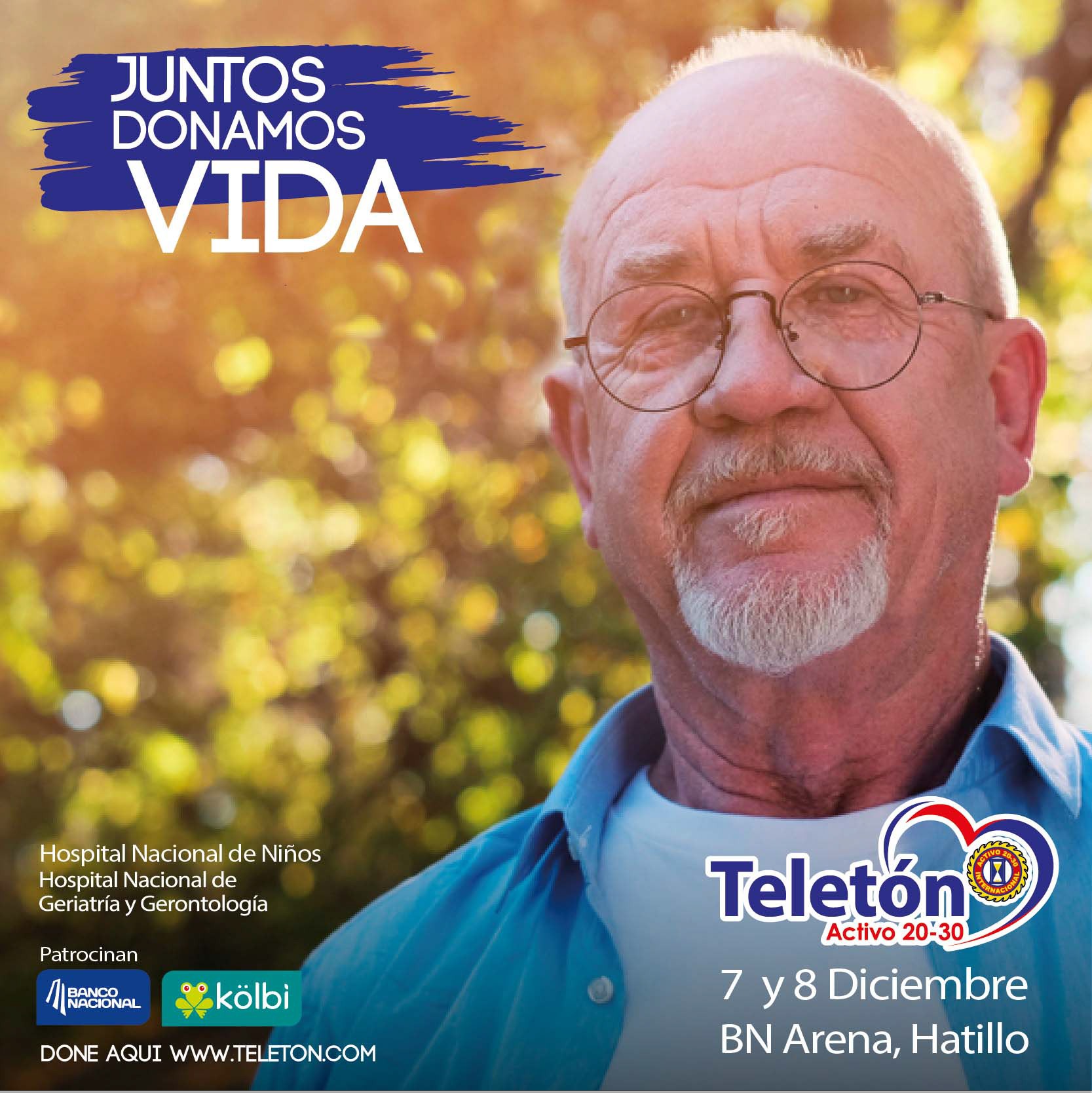
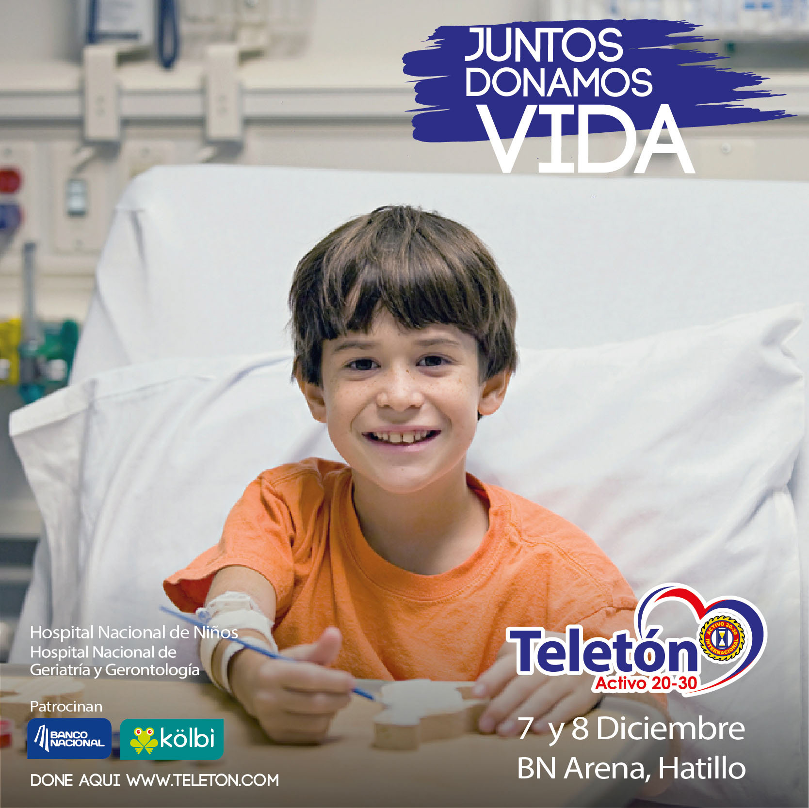
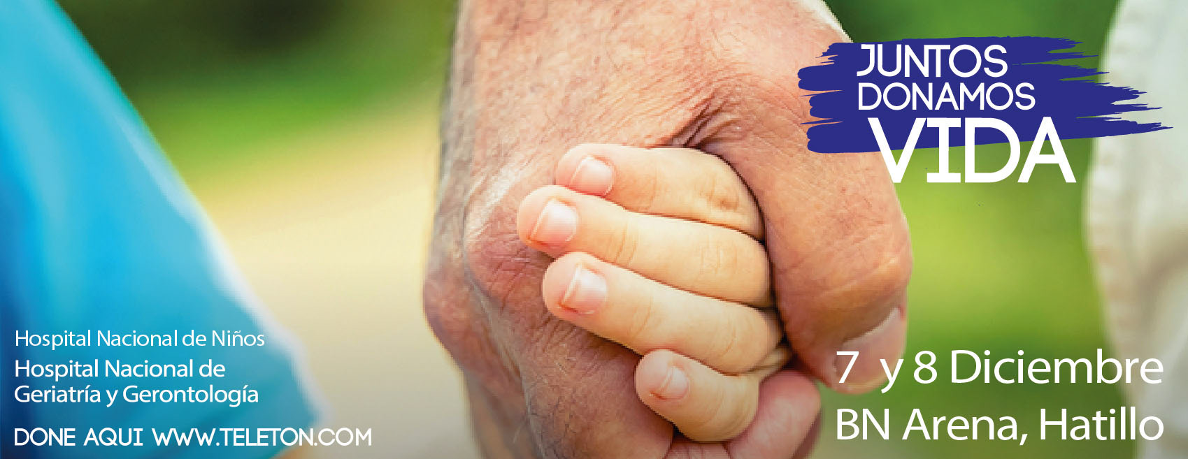
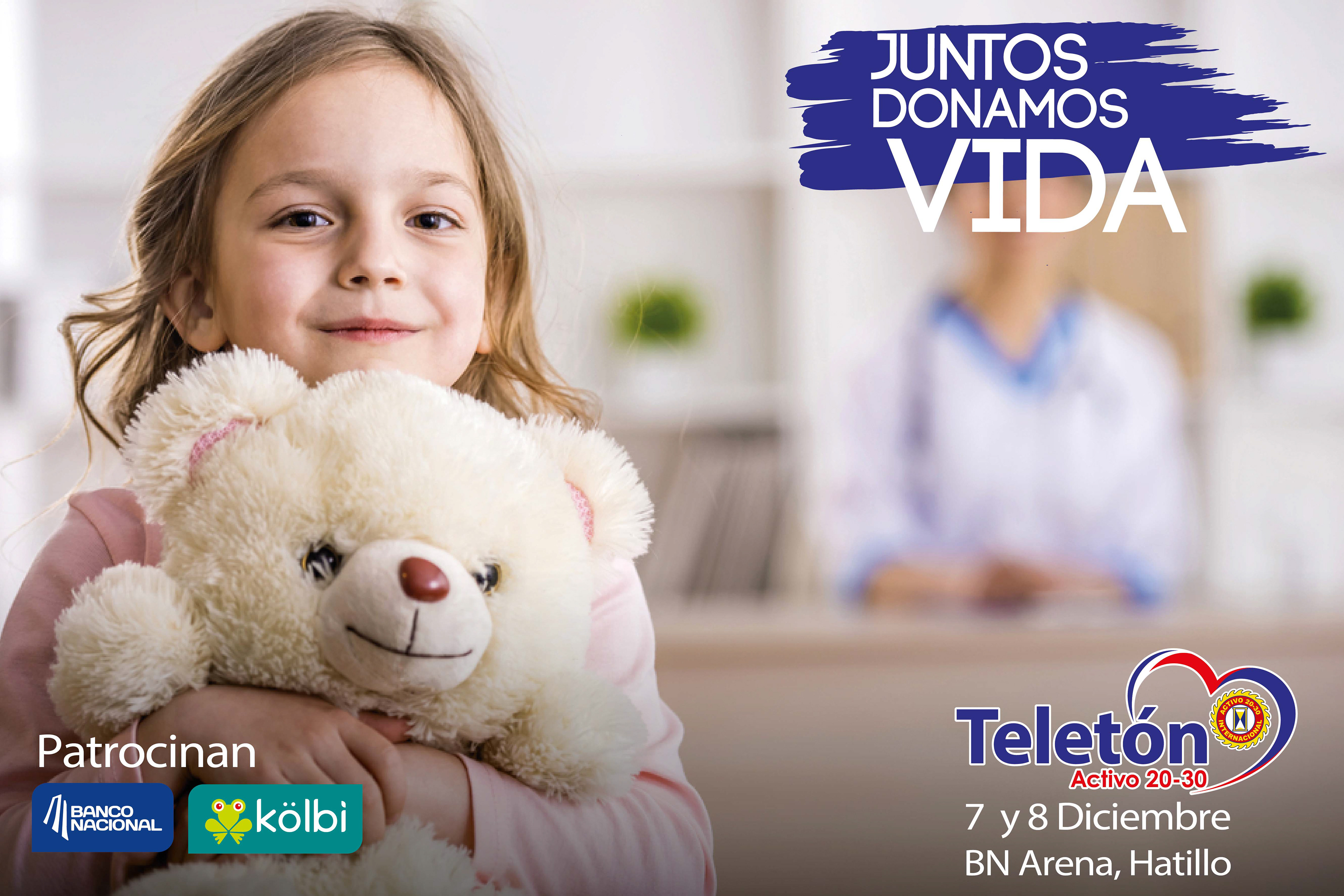
The “Juntos Donamos Vida” campaign for Teleton Costa Rica was built around three key ideas: Connection, action, and results. The phrase “Together” connects with the established national hashtag #JuntosTodoEsPosible signature phrase from Teleton.
Reinforcing unity and community spirit. “We donate” represents the action of collaboration, emphasizing how generosity fosters social wellbeing and emotional connection, as well as the call to action. Finally, “Life” symbolizes the outcome that every donation, no matter how small, contributes to saving lives and creating hope.
Reinforcing unity and community spirit. “We donate” represents the action of collaboration, emphasizing how generosity fosters social wellbeing and emotional connection, as well as the call to action. Finally, “Life” symbolizes the outcome that every donation, no matter how small, contributes to saving lives and creating hope.
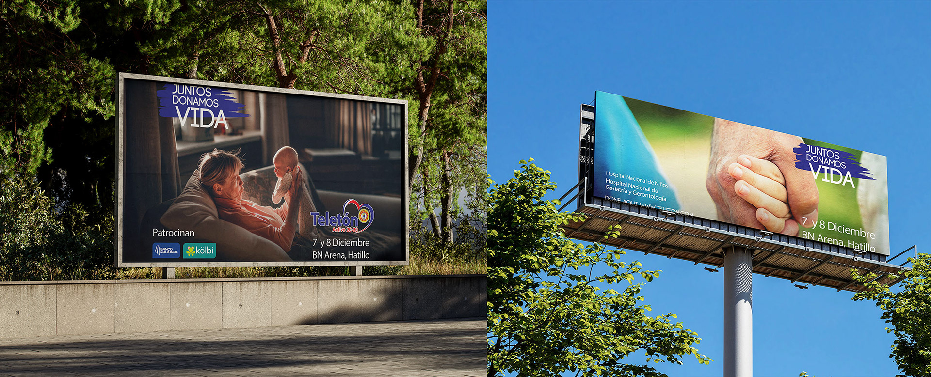
Visually, the campaign used dominant emotional photography with minimal text to convey clarity and sincerity.
The color palette of green, blue, and white reflected freshness, hope, and humility, while the imagery highlighted beneficiaries. Children and adults living happily and confidently align with the message “Together We Donate Life.”
The color palette of green, blue, and white reflected freshness, hope, and humility, while the imagery highlighted beneficiaries. Children and adults living happily and confidently align with the message “Together We Donate Life.”
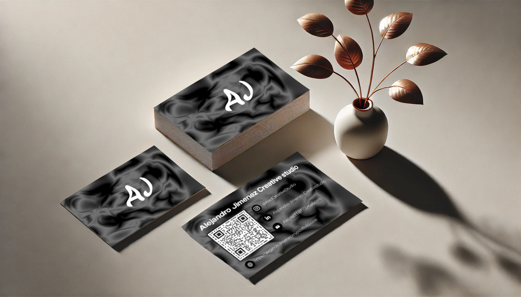
Visuals By Alejandro Jimenez
What can I say, there is no better example than the one you are using right now :)
If you've made it this far, thank you so much for your time and attention. If this is the first tab you've visited, I hope you'll take a look at the others. I hope we can connect, or that at least I've given you some inspiration for a project.
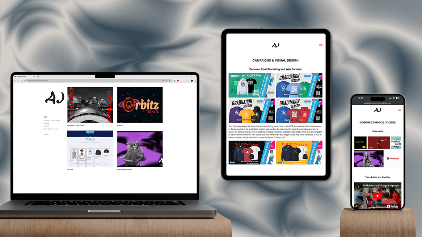
This project focuses on creating a visually balanced and user-friendly interface adaptable across multiple devices.
The design emphasizes clarity and efficiency, ensuring smooth navigation and fast loading times while maintaining a strong visual presence through color use, typography, video, GIFs, and images.
Each layout was optimized to provide an engaging experience where visuals and text complement each other, resulting in a clean and professional presentation that is adaptable to both desktop and mobile environments.
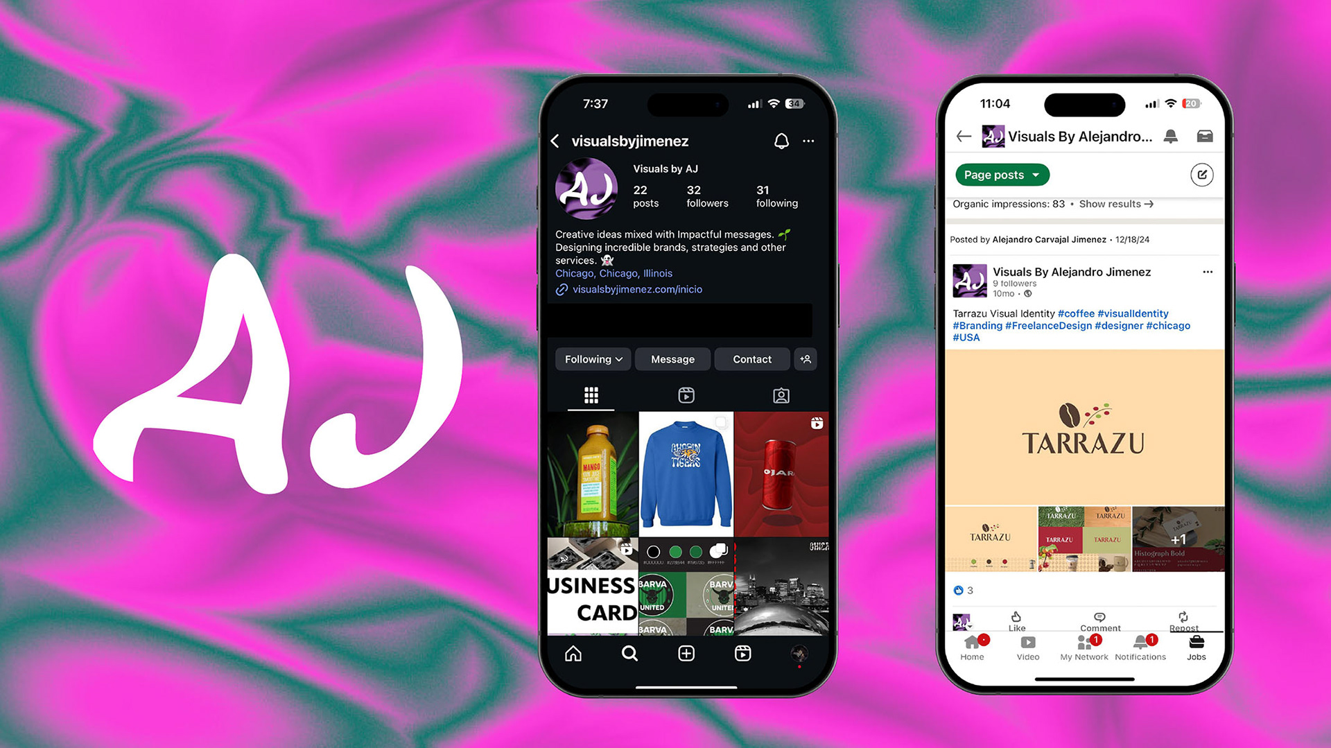
This portfolio section is complemented by my social media. You can discover more of my creative journey through my Instagram and LinkedIn. There, I share design highlights, motions, and new projects that reflect my evolving visual style.