DILEMMA
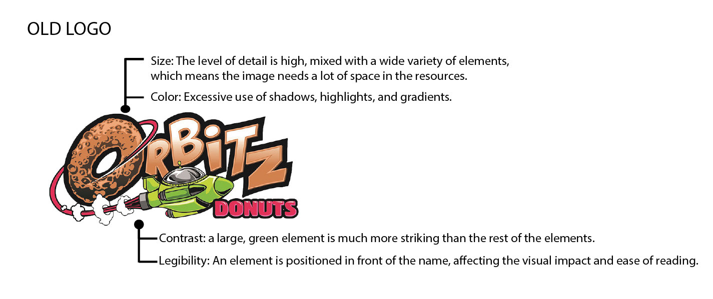
Orbitz had a logo but lacked a clear visual path that they could follow across different media, including digital and print assets. With their old logo, it was difficult to adapt to some materials and backgrounds due to its overload of elements, colors, and text. The solution was not just making a new logo but also a branding and a visual identity that gave the brand more depth and presence against its competition and customers.
Orbitz had a logo but lacked a clear visual path that they could follow across different media, including digital and print assets. With their old logo, it was difficult to adapt to some materials and backgrounds due to its overload of elements, colors, and text. The solution was not just making a new logo but also a branding and a visual identity that gave the brand more depth and presence against its competition and customers.
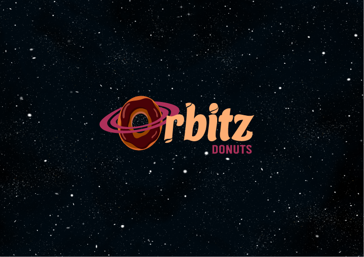
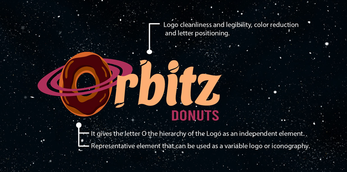
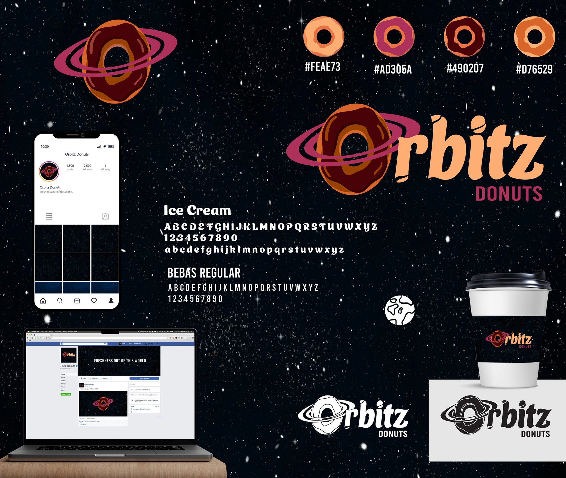
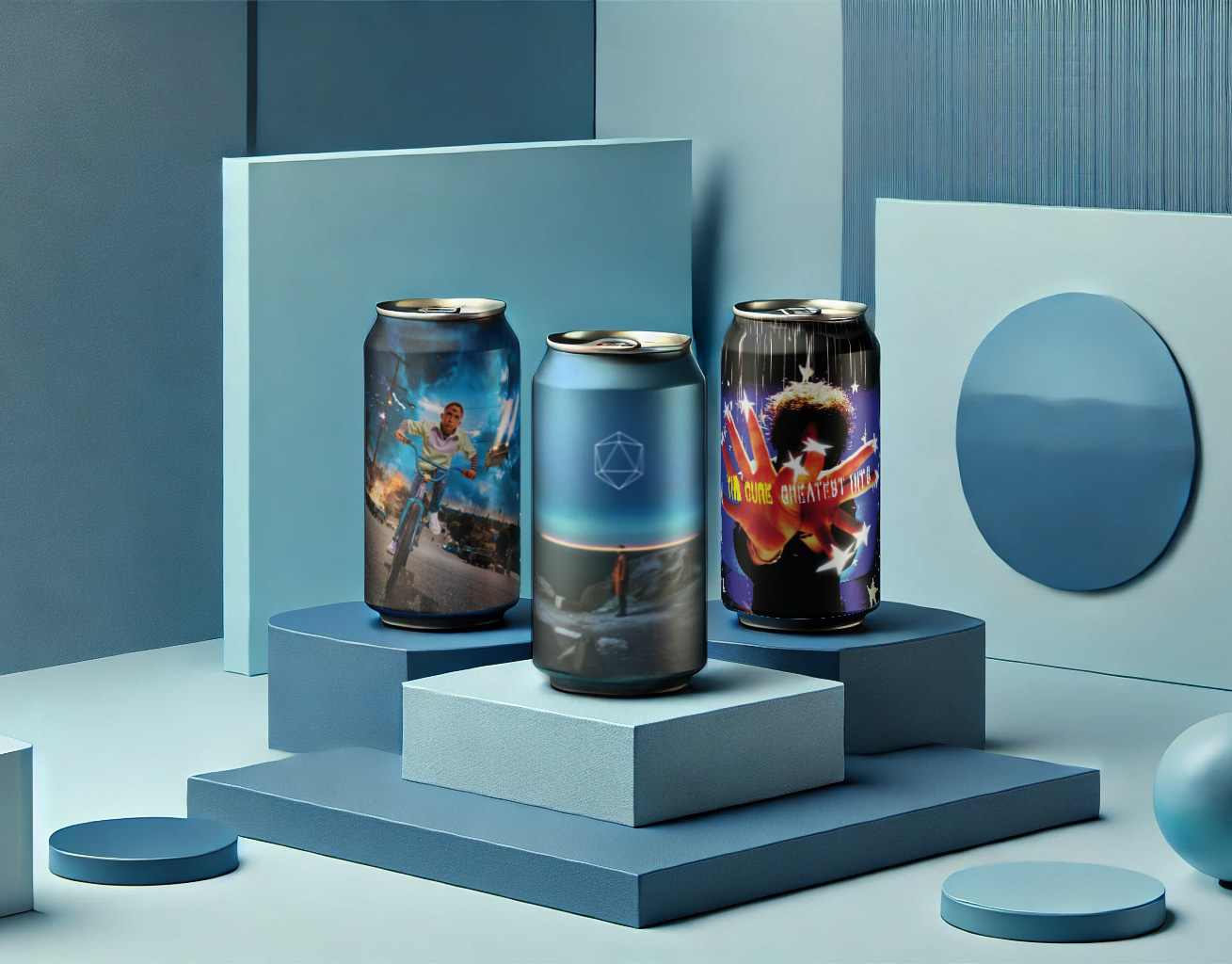
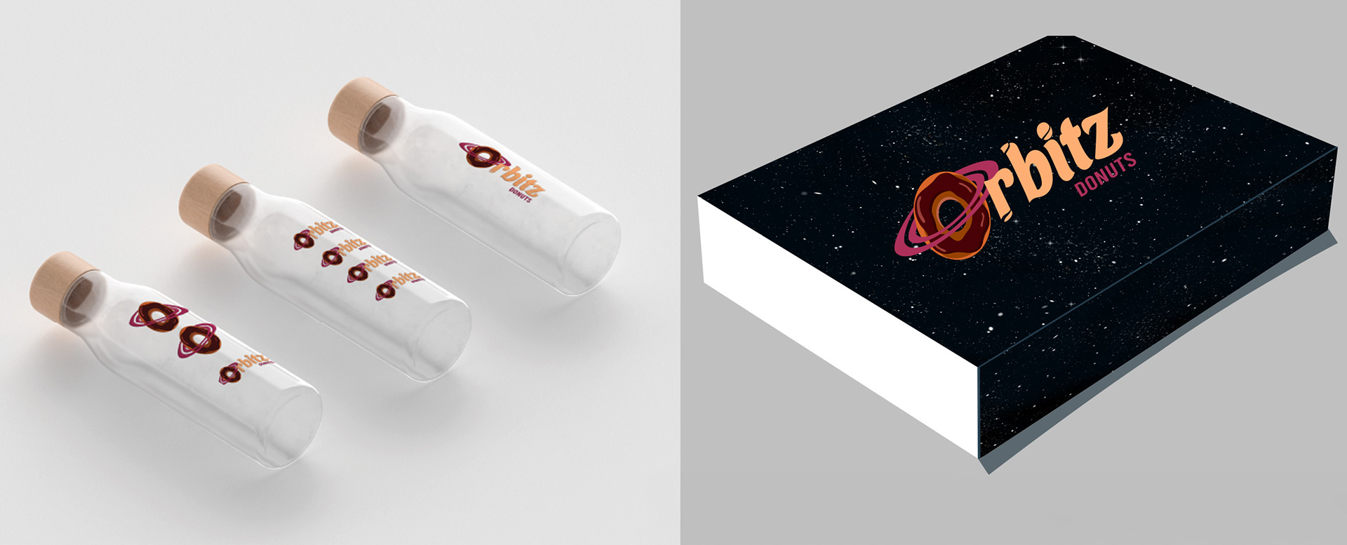
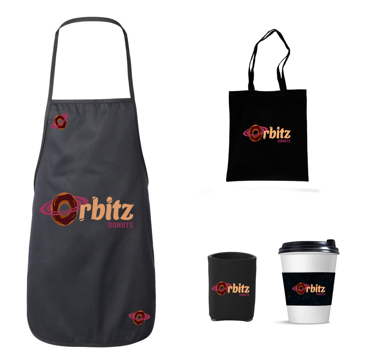
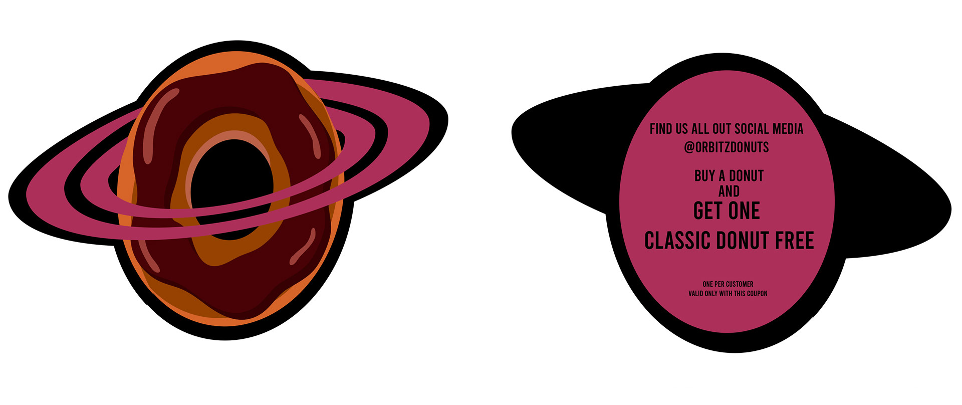
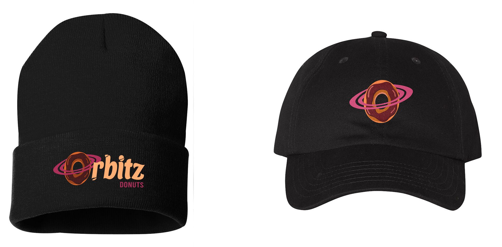
Orbitz Donuts aimed to have a strong presence and a concept that combines both space and the products offered. An analysis was conducted to determine which elements could be used the most and which ones could be discarded. It was decided to make the most important on the hierarchy of the letter 'O,' giving it the shape of both a planet and a donut, an element that can be identified with the brand, either as part of the full logo or as an independent element. Additionally, a color palette that was both space-themed and appetizing. Connected with typographies, backgrounds, icons, and merchandise is clear that Orbitz Donuts now has a whole universe of products and identity to offer.
ROLE
Organized and defined brand goals and direction in collaboration with the owners.
Redesigned the brand logo while maintaining consistency with the established identity.
Developed graphic identity for different media such as Offset and Social media.
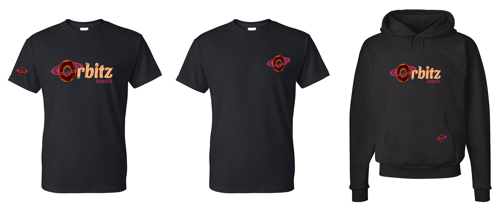
Created merch, marketing materials, and packaging.
Organized and defined brand goals and direction in collaboration with the owners.
Redesigned the brand logo while maintaining consistency with the established identity.
Developed graphic identity for different media such as Offset and Social media.
Created merch, marketing materials, and packaging.
CONCLUSION
Orbitz Donuts was a very interesting project where I had the opportunity to use elements and foundations from an existing project, identifying the standout ideas and enhancing them. It's not every day you get the chance to create a brand and do it in this way, building a complete visual universe, which was incredibly fulfilling.